Case study · Business intelligence
Insights for Everyone
Ten years of research, strategy and design leadership as Qlik reinvented its analytics platform.
- Business intelligence
- Personas
- Usability
Introduction
Qlik was a very successful business intelligence company when I joined as a user researcher in 2012. Its product, QlikView, held a large share of the European market and was expanding rapidly in the US.
However, the product was built on old technology and old interaction models, and would soon be outdated. Qlik needed a completely new approach and decided to build a new product on modern technologies and new UX patterns. The ambition was in the name: insights for everyone, not just for the analytics experts who had championed QlikView.
This was the start of my 10-year journey as a researcher, strategist and design leader. In this case study, I’ve selected some initiatives that illustrate my skills in user research, usability, problem definition, leading design and measuring usage, and how together they helped create a product that even the most basic business users could use.
Qlik was a very successful business intelligence company when I joined as a user researcher in 2012, but QlikView was built on old technology and interaction models. Qlik decided to build a new product on modern technologies and UX patterns, with an ambition of insights for everyone, not just the analytics experts. This was the start of my 10-year journey as a researcher, strategist and design leader, and this case study shows my work in user research, usability, problem definition, leading design and measuring usage.
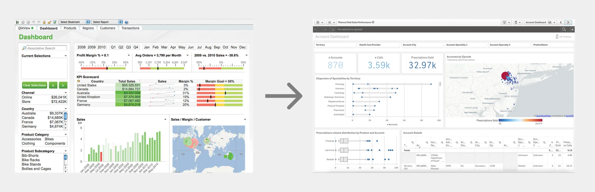
View of the transformation from QlikView to Qlik Sense between 2012 and 2015.
Understanding the user
When I joined, it became clear that Product Management and Engineering were building a system for a narrow target audience. Their main customer contacts were analytics champions, and they were not aware of the various types of end-users the system had to cater for.
I was tasked with carrying out user research and creating personas to inform the design and development process for the next generation of BI software.
My research revealed an intricate web of relationships that an enterprise depends on to get value from data and analytics. Instead of one type of user, we had many very different target audiences with their own needs and requirements.
When I joined, Product Management and Engineering were building for a narrow target audience, mainly the analytics champions they talked to. I was tasked with user research and personas to inform the next generation of BI software. My research revealed an intricate web of relationships an enterprise depends on to get value from data: not one type of user, but many very different target audiences with their own needs.
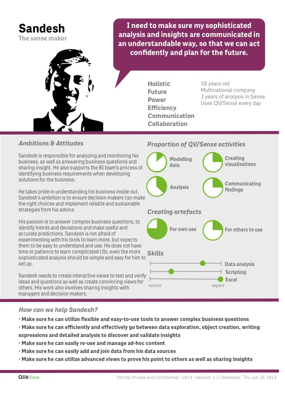
I spent a lot of time educating people about these target audiences. After a while, we could see a big shift in how people in Qlik talked about their users and the overall understanding of needs.
Personas are often criticised for being based on assumptions. Ours were based on over 100 interviews, which ensured their validity.
I spent a lot of time educating people about these target audiences, and after a while we saw a big shift in how Qlik talked about its users. Personas are often criticised for being based on assumptions. Ours were based on over 100 interviews.
The in-depth user research and high-quality personas had a significant impact on the design and success of the product by ensuring that the differences in user needs were accounted for.
Evaluating prototypes
As the design team broke new ground with an experimental approach to dashboard creation and analytics, I supported them with usability testing of prototypes. We had to make sure that the experiences met the needs and expectations of our target audiences.

I performed usability testing in Canary Wharf
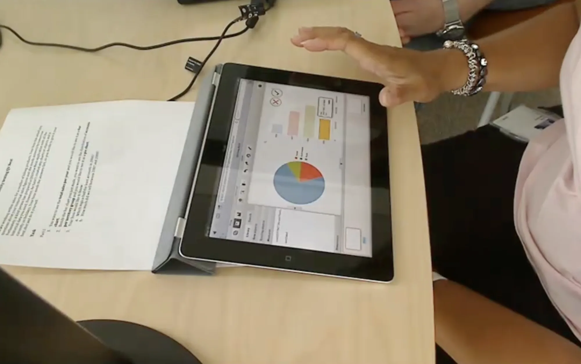
Evaluation of early prototype with a business user
For instance, I travelled to Canary Wharf in London and Wall Street in New York to evaluate prototypes with some of Qlik’s most important and high-profile customers. At each customer site, I evaluated prototype software with 6-8 people, recruiting three people from each target audience. This was also an opportunity to complement my previous user research effort by asking participants detailed questions about their context and needs.
I also managed studies with external testing agencies to widen the reach and depth of our usability efforts. Later on, Qlik hired two dedicated usability specialists to continue to ensure the high usability of the system.
For instance, I travelled to Canary Wharf in London and Wall Street in New York to evaluate prototypes with some of Qlik's most important customers, testing with 6–8 people per site, three from each target audience, and asking detailed questions about their context and needs. I also ran studies with external agencies to widen our reach, and Qlik later hired two dedicated usability specialists.
Thorough testing with different target audiences ensured that the foundations of the system had high usability and met the needs of our end-users.
Describing the problem space
As Qlik's offering grew beyond dashboards, so did the range of user experiences we needed to address. The engineering teams were working in silos and they needed support to bridge these silos. I took on the role of strategist to make sure the experience connected seamlessly across the different offerings.
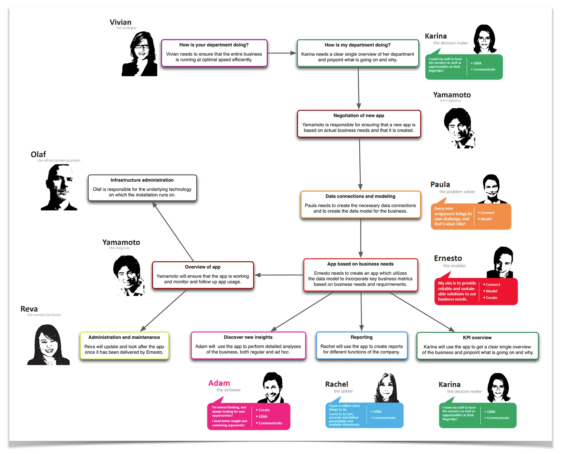
For instance, data people create data models, BI developers create dashboards for others to use, business people consume dashboards and admins ensure that data and applications are secure. To support the UX architecture, I created relationship diagrams showing how all the pieces connected.
As Qlik's offering grew beyond dashboards, the engineering teams worked in silos. I took on the role of strategist to make sure the experience connected seamlessly: data people create data models, BI developers build dashboards, business people consume them and admins keep everything secure. I created relationship diagrams showing how all the pieces connected.
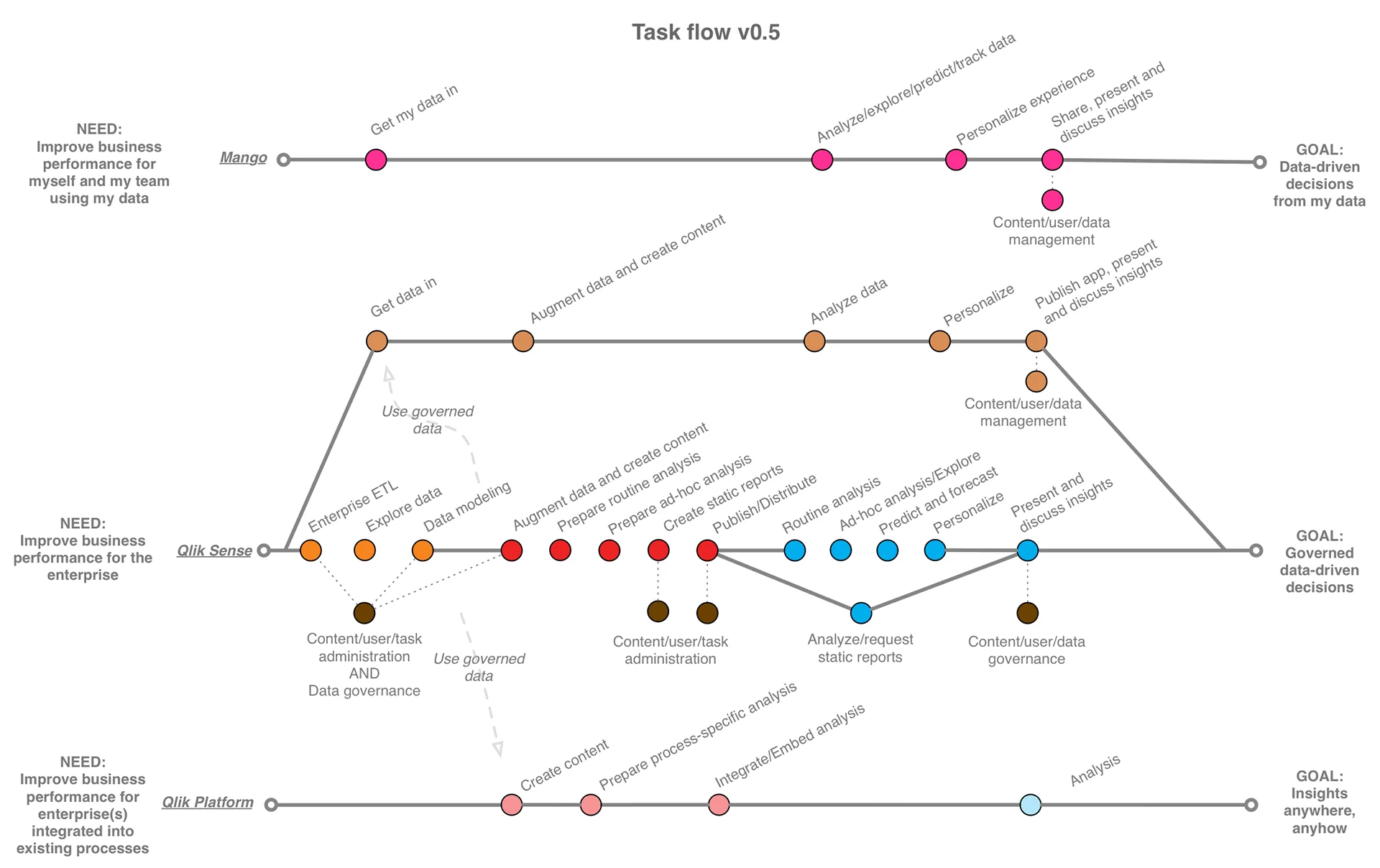
This visual information architecture helped the design organisation see how different experiences related to each other, and create a product offering that catered for each step of the data and analytics workflow.
New innovations for BI
As more and more dashboard products entered the market, Qlik needed to up its game with innovative approaches to data and analytics.
At this time, Product Management was working on new, elaborate feature sets to ensure we were ahead of the competition. However, their descriptions were very technical and focused on the technology rather than the difference it would make for users.
In the design group, we had a wealth of user research and defined target audiences that were being overlooked. To address this, our user researcher and I created a value-mapping approach called the Product Value Cube (PVC). It was specifically designed to remedy the two issues of mapping features in silos and discussing solutions before we knew the problem and target audience. The PVC ensured we covered business, customer, user, design and engineering in one view:
As competition grew, Product Management worked on new feature sets, but their descriptions focused on the technology rather than the difference it would make for users, while our user research was being overlooked. So our user researcher and I created the Product Value Cube (PVC), a value-mapping approach that covers business, customer, user, design and engineering in one view, before anyone talks solutions.
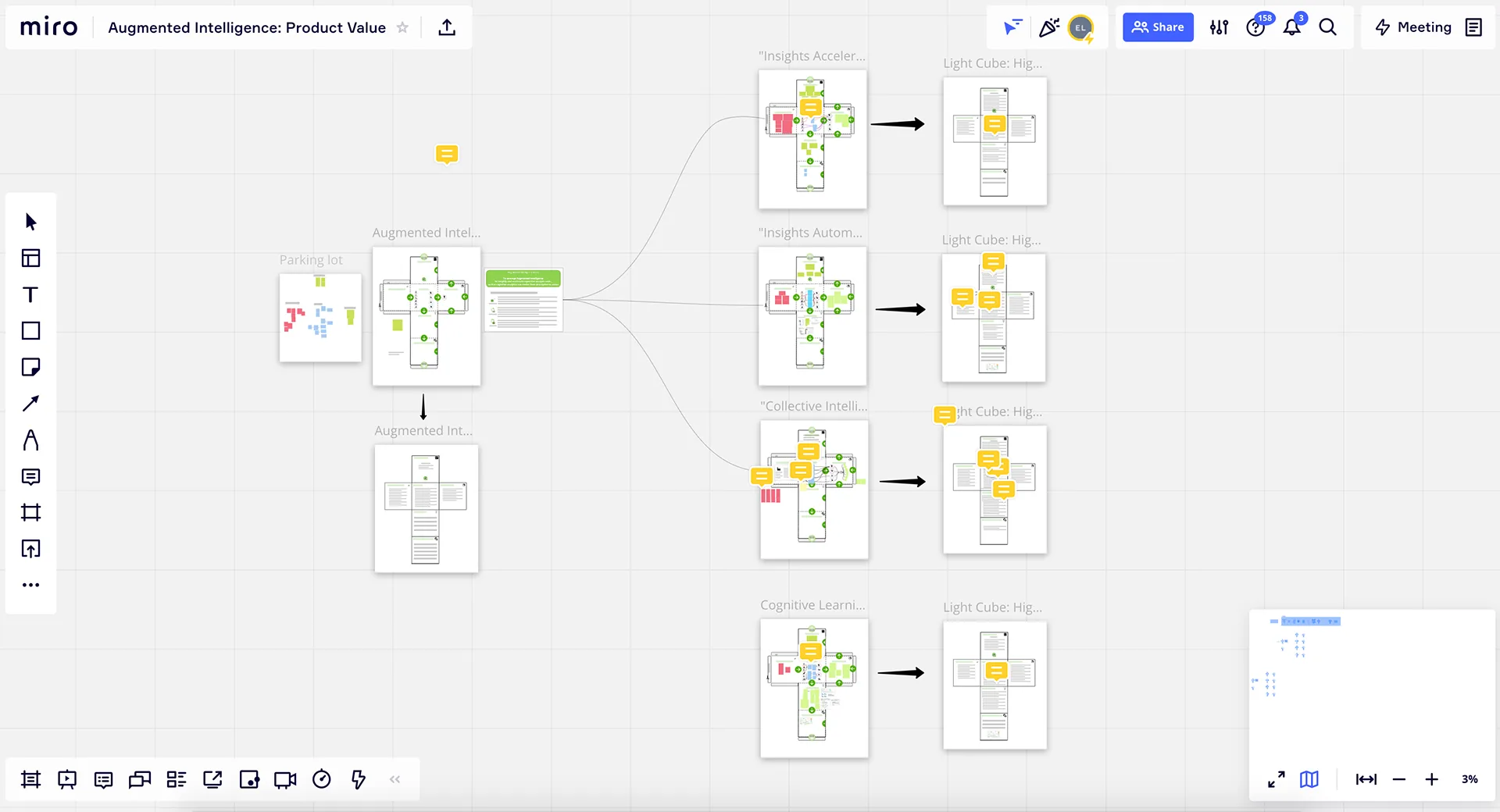
From a set of workshops mapping the product value space
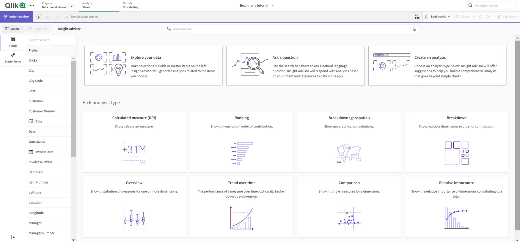
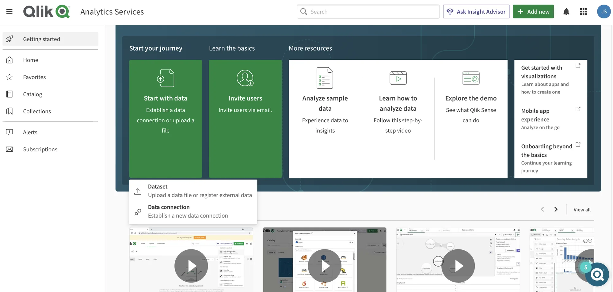
Qlik Sense Insight Advisor, one of the key features emerging from the innovation workshops.
I used the PVC as a workshop tool with Product Managers to redefine their feature sets around customer and user needs.
With the help of the Product Value Cube, I was able to raise the quality of problem definitions and ensure they included customer and user needs.
Mapping the SaaS trial experience
As Qlik moved from on-premises software to SaaS, a natural step was to let customers try before they buy: “the trial experience”. It was not yet clear what the best customer experience would be, so a project team from Design, PM, Marketing and Sales was set up to find out.
In order to build the journey we needed a better understanding of the target audiences trying our system. At the time, customers could download the application to try it, and were then contacted by Direct Sales. We interviewed salespeople who spent their days talking to these customers and knew their needs well. With a much better understanding of the trial customers’ needs we set out to create a trial experience journey.
To suit the needs of our group, I created a customer journey template that contained phases, emotions, thoughts and opportunities. The template was created in a design tool and printed on large sheets to use with Post-it notes.
In the workshops we had participants from PM, Design, Marketing and Sales. Some of the most experienced salespeople were selected as the voice of the customer.
As Qlik moved to SaaS, we needed a “try before you buy” trial experience, and a team from Design, PM, Marketing and Sales was set up to shape it. We interviewed the salespeople who talked to trial customers every day, and I created a customer journey template with phases, emotions, thoughts and opportunities. In the workshops, our most experienced salespeople acted as the voice of the customer.
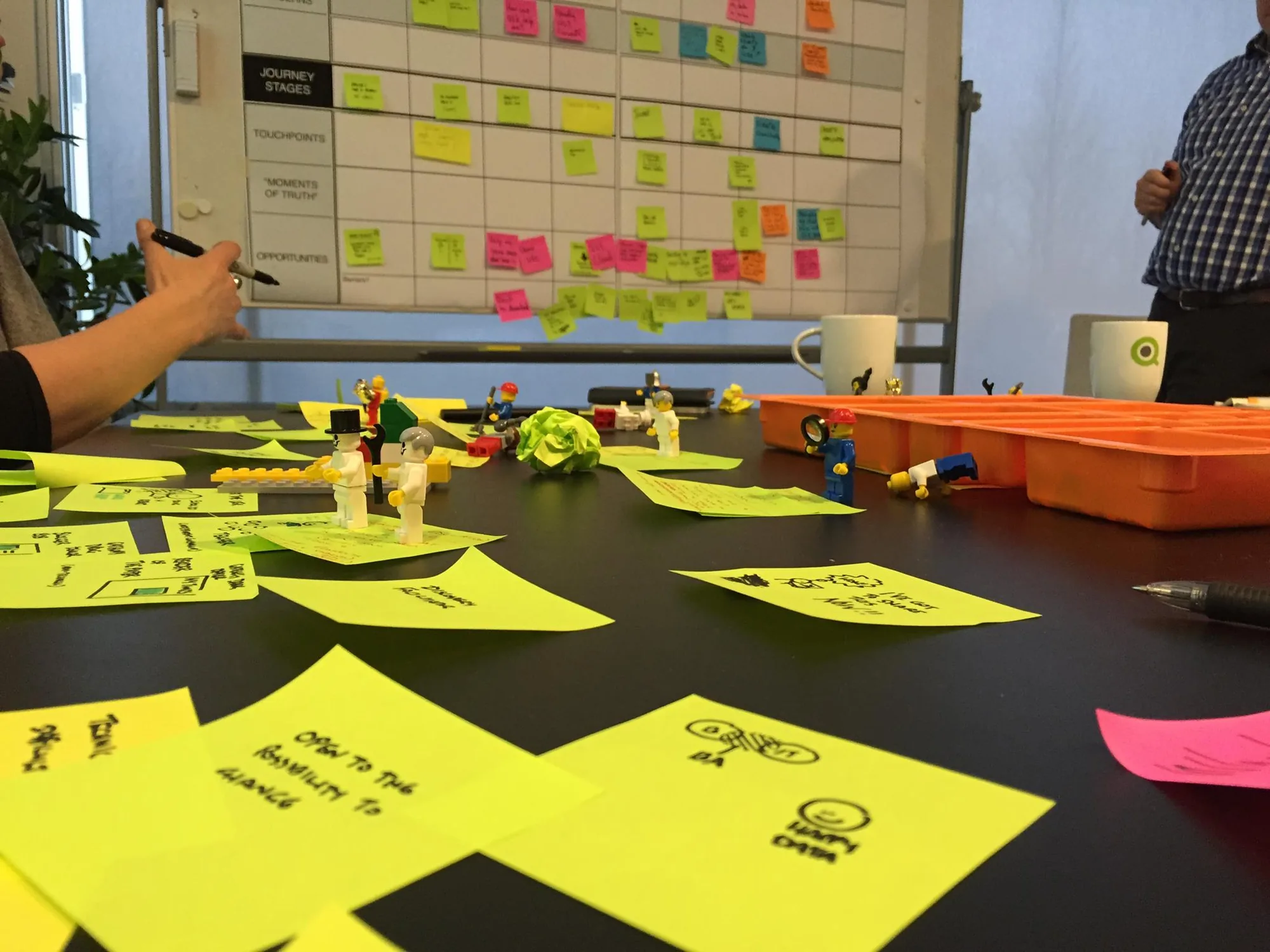
The journey was mapped out using Post-its and then refined by a visual designer in Photoshop.
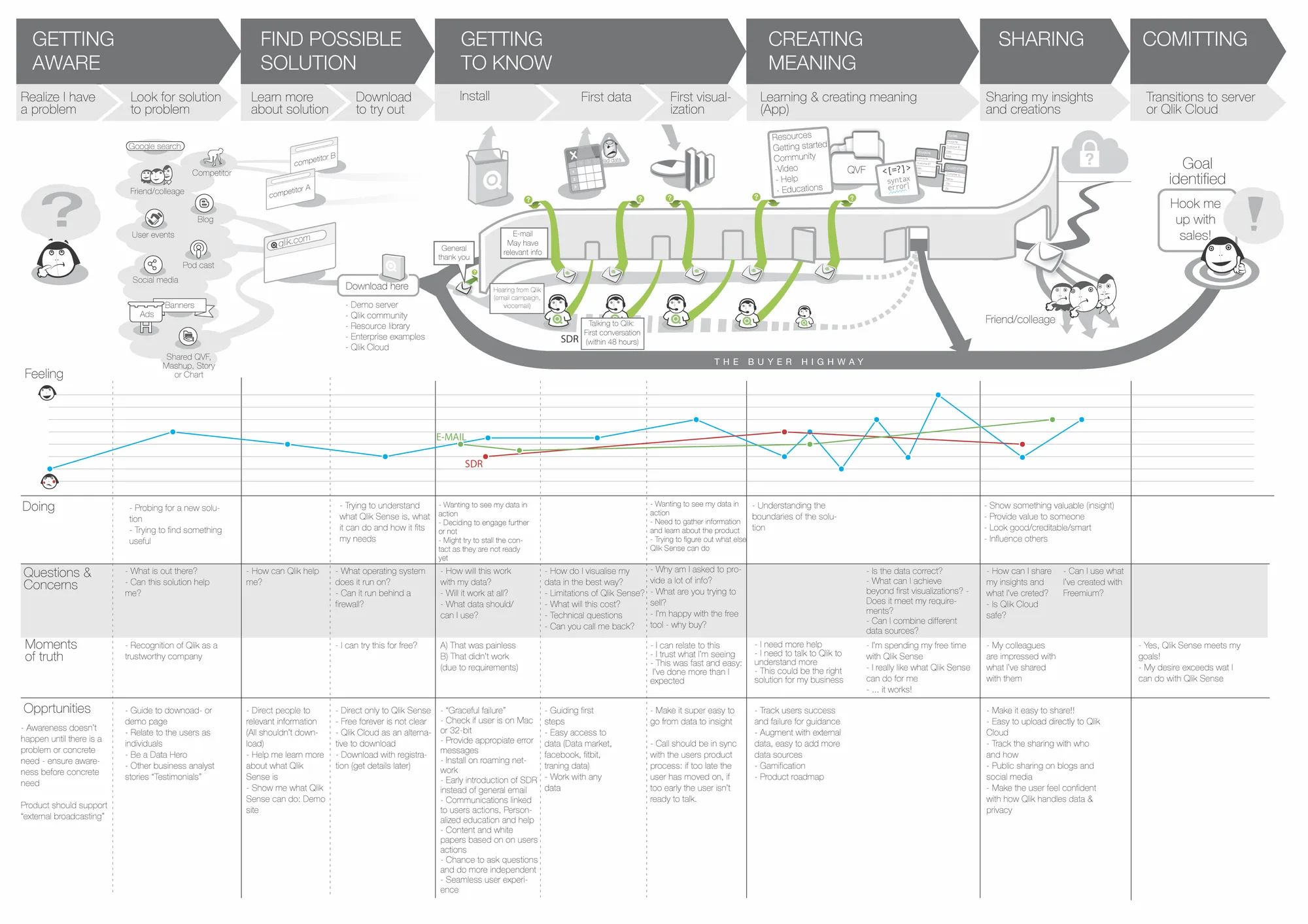
This project gave Product Marketing a solid journey map, which they used to anchor the work with senior management and other key stakeholders.
Agile usability
As Design Manager, I constantly worked on the challenge of delivering just-in-time usability testing. Development was ongoing, driven by an agile engineering process. At the same time, we had to ensure that the capabilities they were working on were tested with end-users. Due to a long backlog of features and hard time constraints, there was resistance to going back and fixing usability issues after release.
I managed a project that developed an agile approach to usability testing to keep pace with the development teams. One main hurdle was recruiting people from the relevant target audiences in time. To address this, we 1) created a pool of customers that were willing to participate in studies and 2) utilised a recruitment service called Userlytics for getting access to first time users.
A second hurdle was making sure the teams got their insights in time. With the help of quick recruitment we were able to set up tests during sprints, testing the capability while in development. We also invited the developers to sit in as silent participants. Seeing people use their capability first-hand meant many relevant findings reached the engineering teams immediately.
As Design Manager, I constantly worked on delivering just-in-time usability testing within an agile process, where there was resistance to going back and fixing issues after release. I led a project to make testing keep pace: we built a pool of customers willing to take part, used Userlytics to recruit first-time users, tested capabilities during sprints and invited developers to sit in as silent participants, so findings reached engineering immediately.
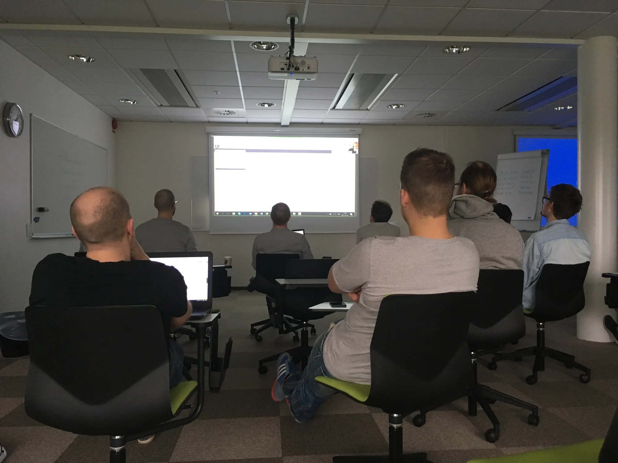
This initiative ensured that usability testing was performed as part of the agile process. It also had the added benefit of deepening the development teams' empathy for end-users.
Designing a better first experience
The trial experience was not providing the desired conversion rates and senior management was keen to improve the flow. At the time, Qlik had been losing a lot of revenue to Tableau, who had a much stronger impact in the do-it-yourself analyst market segment in the US.
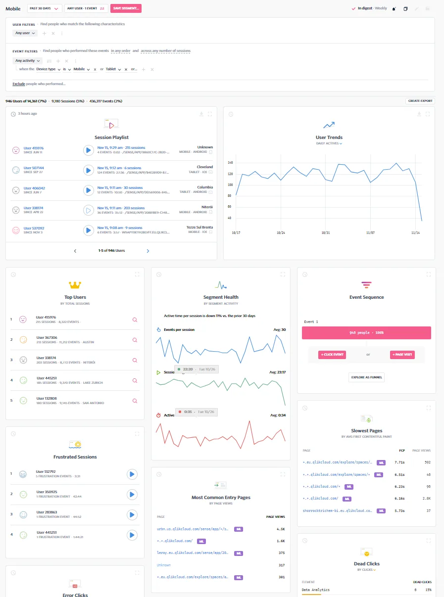
After moving to SaaS, Qlik was in a much better position to measure customer behaviour. By analysing customer usage data, we gained insights into how users were struggling with understanding the Qlik value proposition. We complemented this with a user research study, where I led a researcher to gain a deeper understanding of customer behaviour. The study used semi-structured interviews with prospective customers, asking detailed questions about the trial period.
The trial experience wasn't converting, and Qlik was losing revenue to Tableau in the do-it-yourself analyst market. After moving to SaaS, we could measure behaviour: usage data showed users struggling to understand Qlik's value proposition, and I led a researcher in semi-structured interviews with prospective customers to understand why.
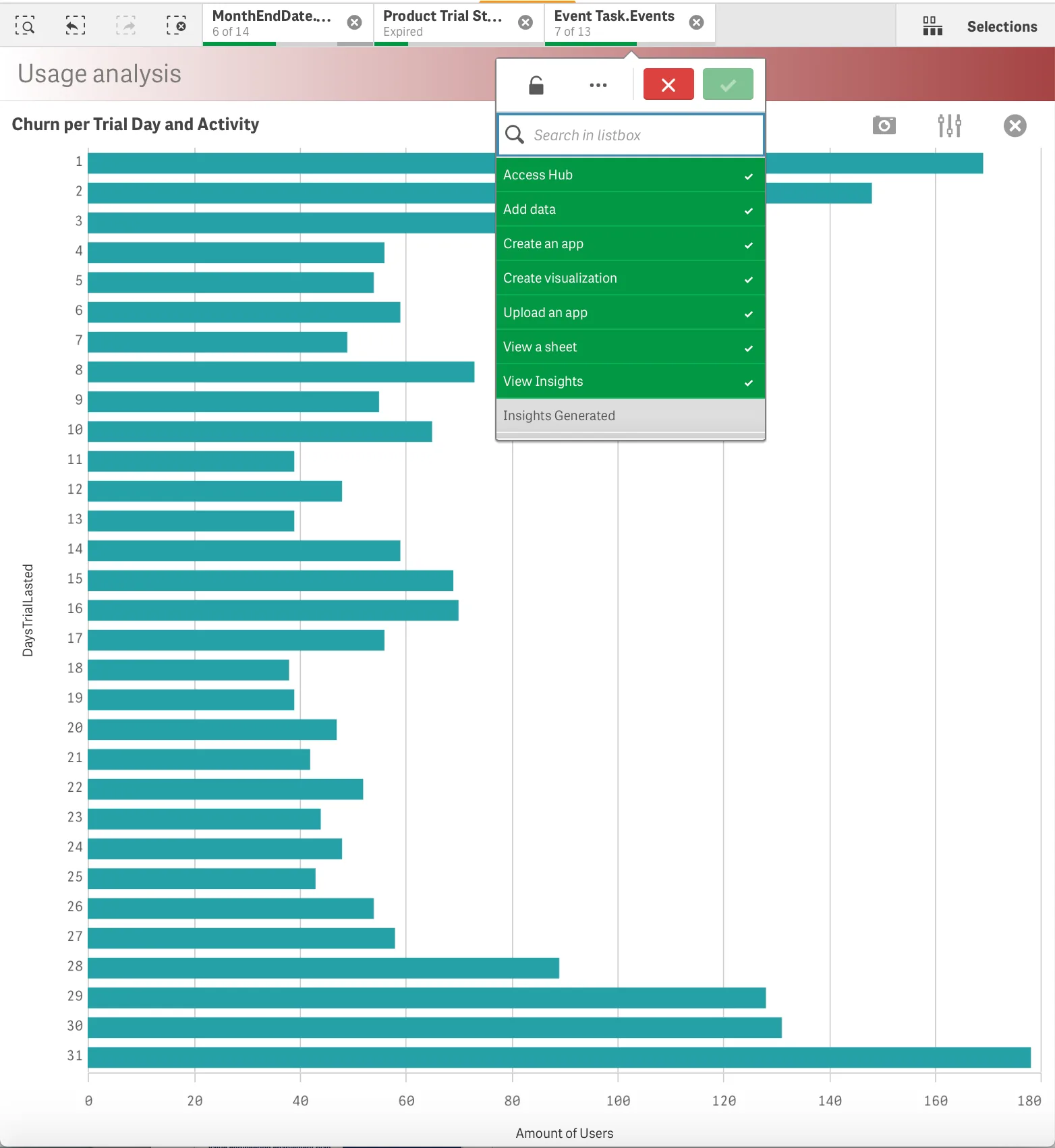
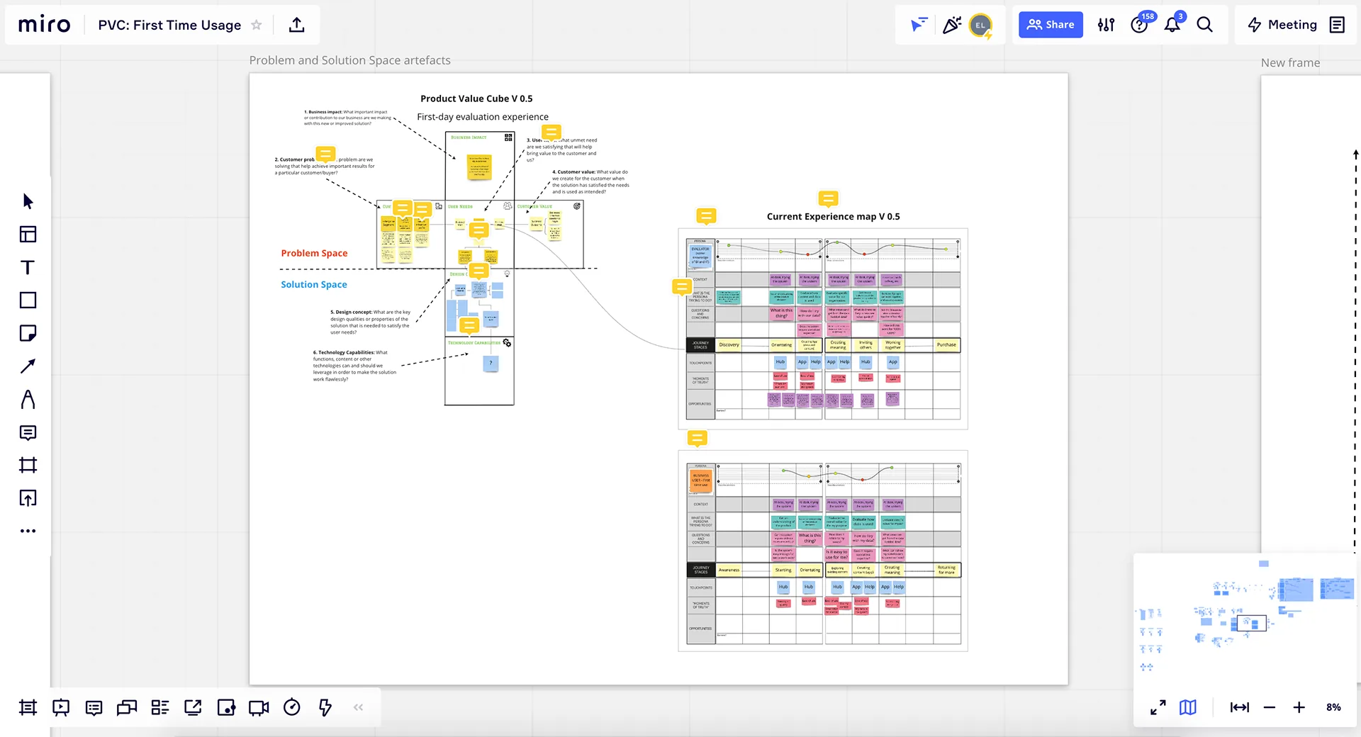
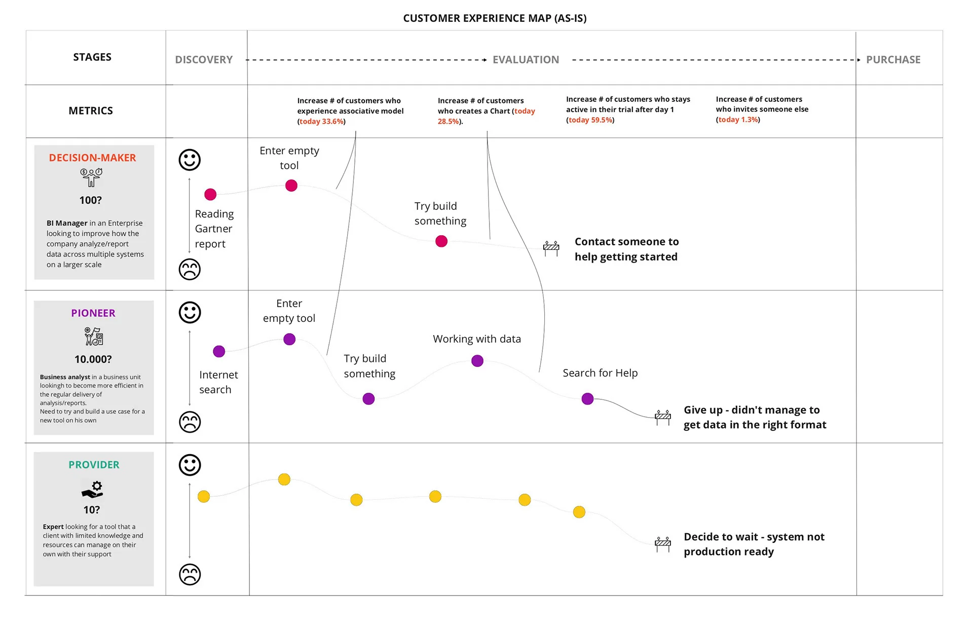
With the help of the user researcher, we used the data to map out the problem from a value perspective using our internal template called Product Value Cube. The Product Value Cube provided a structured format for aligning what we needed to achieve from a Business, Customer, User, Design and Engineering perspective. In order to further contextualise the trial experience, I mapped it as a customer journey highlighting the key opportunities for fixing the experience.
As senior management was pushing hard for new designs, a designer had already started to sketch out a prototype for improving the experience. However, as the solution was shared with more designers and product stakeholders, it became clear that there were conflicting interests of what direction the product should take.
We had a good understanding of the problem space. We had mapped it in the Product Value Cube and as a customer journey, but we were far from aligned in what the solution should look like. At the same time, several new product initiatives needed to align with a potential new product direction.
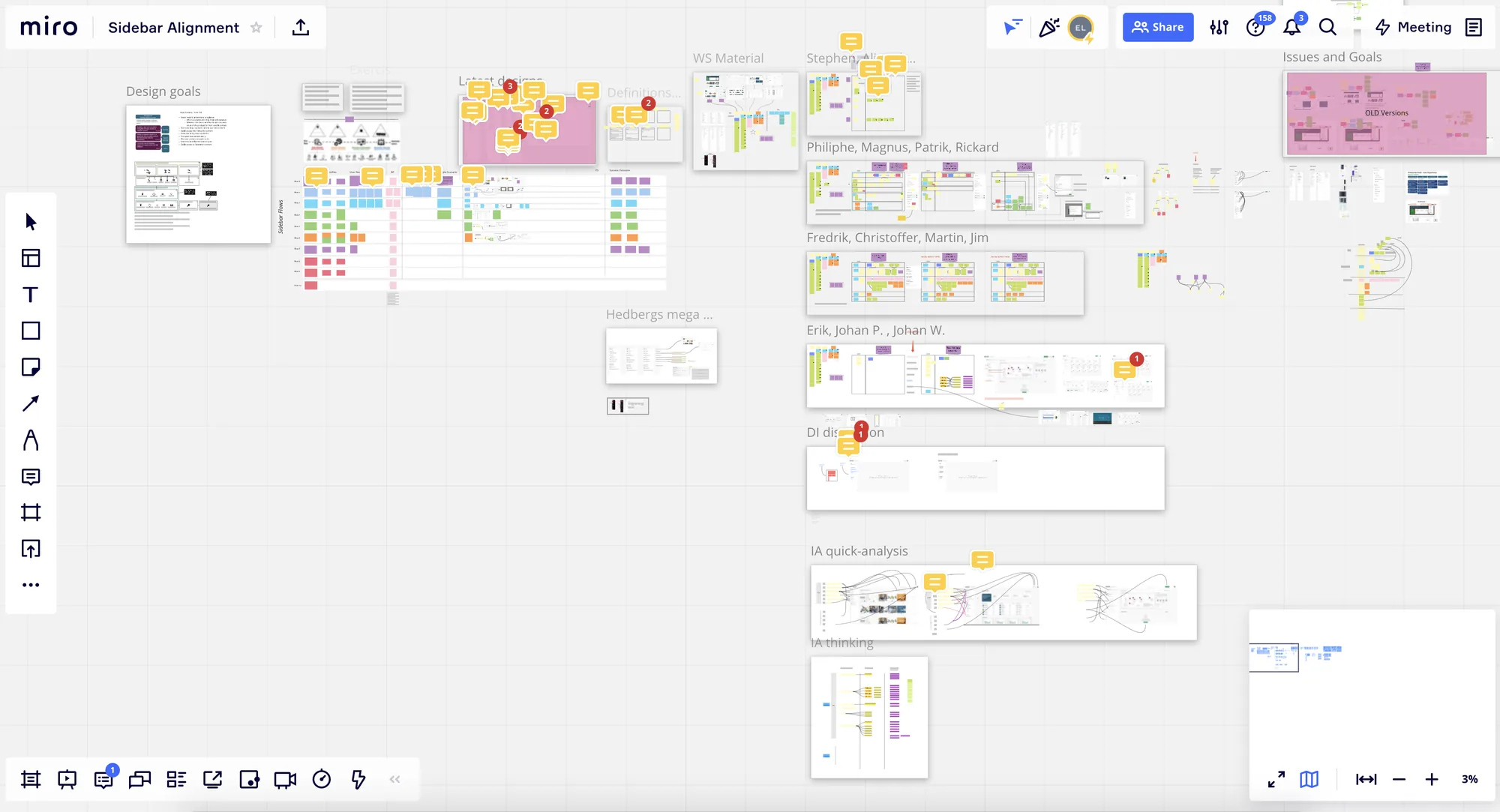
After some negotiation with senior management, we got the mandate to initiate a larger project with additional design resources. It became clear that we needed to connect the design work with target audiences, user needs, user flows and desired outcomes.
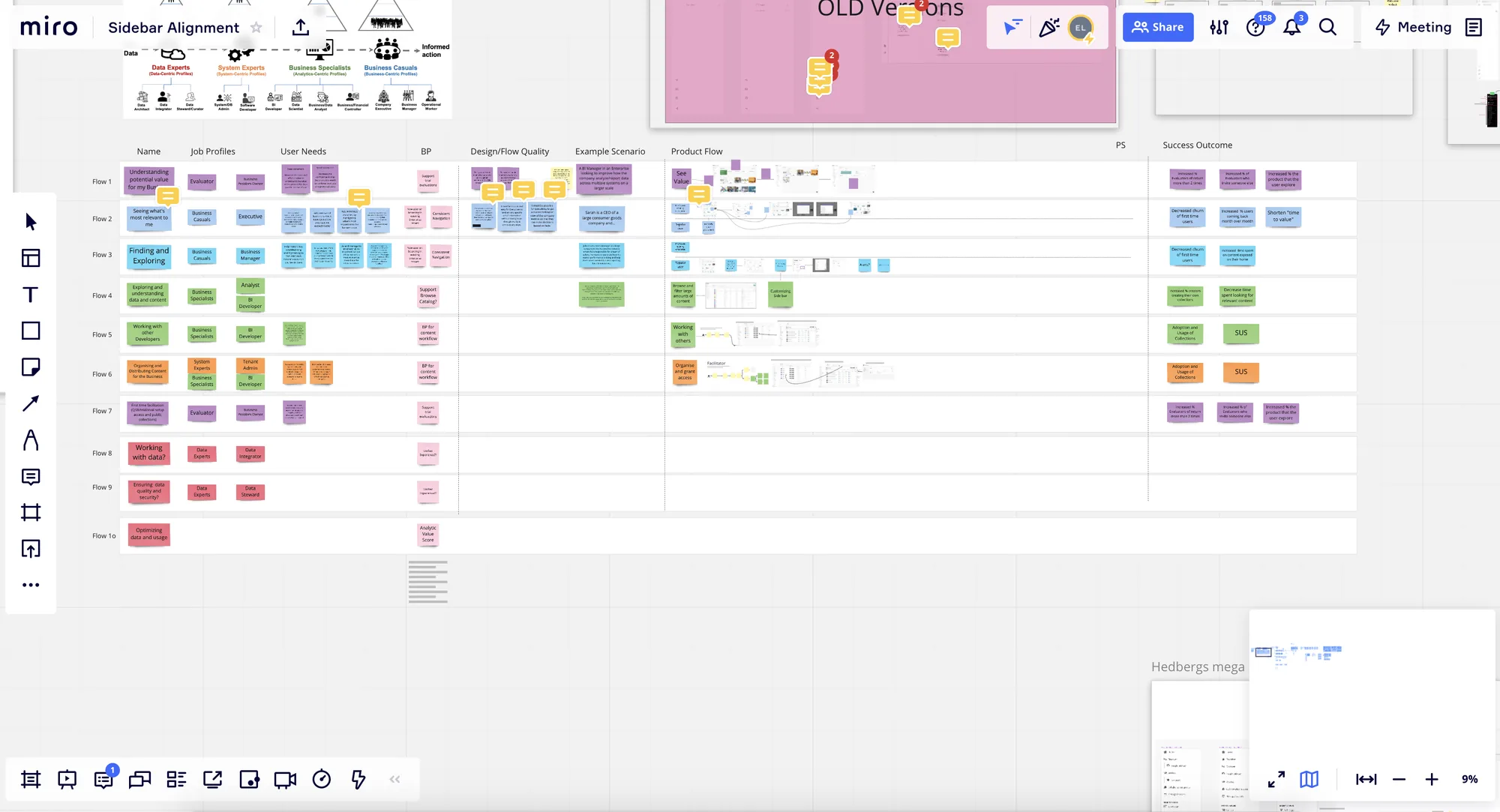
Using the information we had so far, we lined up our target audiences against our user flows in a series of workshops. For each target audience, I moderated sessions where we mapped user needs, high-level user flows and measurable outcomes.
A designer had already started on a prototype, but as it was shared it became clear there were conflicting views on the product direction. We understood the problem, but were far from aligned on the solution. After negotiating with senior management, we got the mandate for a larger project, and I moderated workshops for each target audience, mapping user needs, high-level user flows and measurable outcomes.
At this point, there was still disagreement about which design direction to take. I saw this as a great opportunity to explore multiple ideas, build several prototypes and test different routes. Thankfully, we got manager buy-in by showing good progress from the workshops and by demoing prototypes already in the making. The whole design team was very passionate about finding the right solution to the problem, which really helped us keep a high pace throughout the work.
As the prototypes were refined to align with the workshop outcomes, we set up a plan for end-user testing. Our usability specialists set up remote testing with the service provider Userlytics, which let us screen and recruit people matching our target audiences.
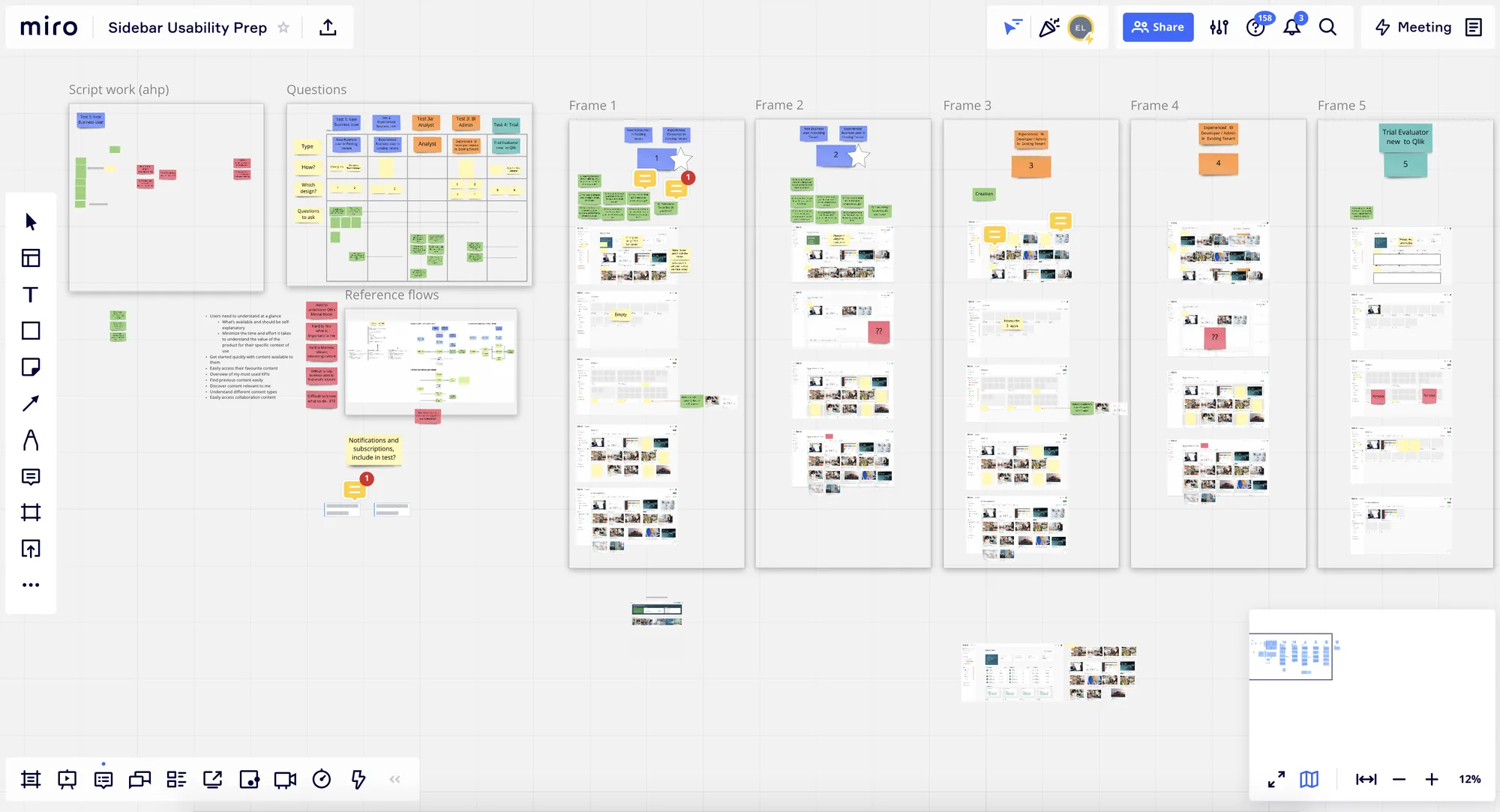
Planning the usability tests
A/B testing of the two prototypes revealed that both approaches had merit. However, one prototype, with a more Netflix-like experience model, met user needs most effectively and efficiently. In addition, there were a handful of concepts in each prototype that we could evaluate for their usefulness and usability. We combined the best of both prototypes, which led to a significant change to the existing offering.
Conclusion: Insights for everyone
When I joined Qlik, the product was built for a narrow group of analytics champions. Through user research, personas and extensive usability testing with every target audience, we created a system that was inclusive of a much wider range of users, from data specialists and BI developers to business people who simply need answers from their data.
Most importantly, we ensured that even the most basic business users were able to use Qlik Sense, not just the experts. That is what "insights for everyone" meant to me: real value for customers and end-users, backed by evidence rather than opinion.
Through user research, personas and extensive usability testing, we created a system that was inclusive of a much wider range of target audiences than the analytics champions it was first built for. Most importantly, we ensured that even the most basic business users were able to use Qlik Sense, which is what "insights for everyone" meant to me.